Introduction
www.rockslice.no
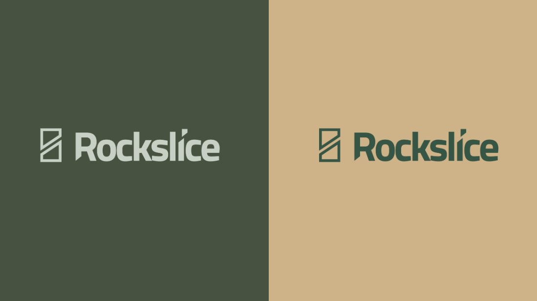
We gave Rockslice a design lift and created their new logo and colour palette. Rockslice is a forward-leaning and innovative tech company that has developed its own robot for automated 3D stone extraction. Their robot cuts blocks out of bedrock or concrete, in any shape and size, with remarkable precision. Rockslice does not only shape stone, it shapes the future of construction.
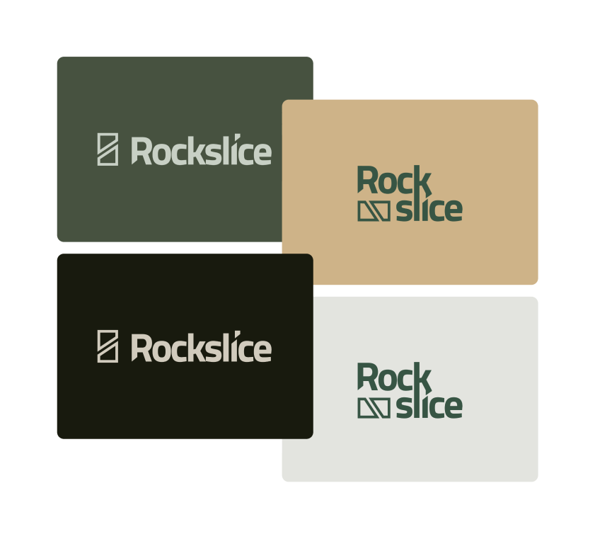
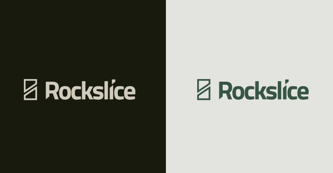
The colours for Rockslice were chosen carefully to reflect the innovative nature of the company and its forward-looking approach. The dark forest green signals reliability and stability, which is essential in the construction sector, while also evoking nature and sustainability. The light sand tone adds precision and creativity for the company focus on quality. Deep blackish green gives depth and authority, reflecting the deep rock where stone extraction takes place. Beige bridges the darker and lighter tones, adding a natural sense of elements working together in harmony. Together these colours form a coherent palette that balances strength, precision, innovation and sustainability, and strengthens the identity of Rockslice as a pioneer in automated 3D stone extraction.
The solution
Precision
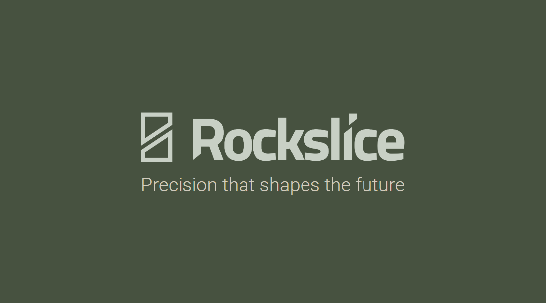
We wanted to reflect the ability of the robot to make extremely accurate cuts in stone and concrete, which is decisive for delivering quality and innovation to customers. This was built into the way the icon is sliced in two. The typography in the logo is marked by sharp, straight lines that convey strength, precision and professionalism.
The solution
Shapes
This symbolises the ability of Rockslice to transform raw materials into desired shapes and structures. It is not only about cutting, but about creating: shaping buildings, infrastructure, landscapes and the future. That ability to transform was built into the way we see part of the R within the I. The minimalist, clean icon reflects the focus of the company on industrial work, where efficiency and function are central.
The solution
Stability
The overall aesthetic of the logo is solid and stable, which is essential for a company operating in construction. The weight and balance of the logo give an impression of reliability and durability. The logo is simple and easy to recognise, which makes it effective in both digital and physical applications.